Lightning Help Text Component
The standard lightning:helptext component has a strange limitation where it doesn’t work with Lightning Out. That’s why I decided to create a quick and dirty custom component to replace it:
Why create a custom component?
A lot of companies are still working in Salesforce Classic, but are slowly transitioning to new Lightning Experience due to all the extra benefits that come with it. During this transition period a lot of them will utilize Lightning Out to render Lightning Components inside Visualforce Pages. I was working for one such company.
The requirement was to build a new form that was supposed to be available both internally and also exposed in Communities, and I was going to build this using Lightning Components hosted in Visualforce Page. The first surprise I got was that lightning:input, at least for now, doesn’t support any Help Text attribute. That made me create a custom input component (more on that some other day) that utilized the lightning:helptext component for the Help Text part. Then came my second surprise - this component doesn’t function properly in Lightning Out.
I asked a question about this issue on StackExchange, but got no answer. The client really needed this feature in his form, so I had no other choice but to create a custom component.
Getting started with code
Go ahead and create a new custom Lightning component named customHelpText. The code is pretty simple and I don’t think it requires much explanations - apart from CSS, that part gave me headaches and I’m still not sure how it works!
Use the code below to build your new component:
customHelpText.cmp
<aura:component >
  <aura:attribute name="text" type="String" required="true"/>

  <div class="slds-form-element__icon">
    <a href="javascript:void(0);" class="slds-form-element__icon slds-align-middle"
      onclick="{!c.handleOnClick}"
      onmouseout="{!c.handleMouseLeave}"
      onmouseover="{!c.handleMouseEnter}"
      tabindex="-1">
      <lightning:icon class="slds-icon-text-default ms-help-icon" size="xx-small"
        iconName="utility:info"/>
      <span class="slds-assistive-text">Help</span>
	</a>
    <div aura:id="divHelp" class="slds-popover slds-popover_tooltip slds-nubbin_left-top ms-help-popup-in-header slds-hide"
      role="tooltip" aria-live="polite">
      <div class="slds-popover__body ms-help-popup-body">
	    <ui:outputText value="{!v.text}"/>
	  </div>
    </div>
  </div>
</aura:component>
customHelpTextController.js
({
  handleOnClick : function(component, event, helper) {
    $A.util.toggleClass(component.find("divHelp"), 'slds-hide');
  },
  handleMouseLeave : function(component, event, helper) {
    $A.util.addClass(component.find("divHelp"), 'slds-hide');
  },
  handleMouseEnter : function(component, event, helper) {
    $A.util.removeClass(component.find("divHelp"), 'slds-hide');
  },
})
The handleOnClick function is triggered by onClick event and it will allow this component to function properly when displayed on a mobile device. It will allow users to click on it in order to display a helpful message.
customHelpText.css
.THIS .slds-icon{
    width: 1.1rem !important;
}

.THIS .ms-help-popup-in-header {
    display: inline-block;
    position: absolute !important;
    top: -10px !important;
    left: 55px !important;
    margin-left: -1rem !important;
    max-width: 20rem !important;
    overflow: visible !important;
    text-transform: none !important;
}

.THIS .ms-help-popup-in-header:before, .THIS .ms-help-popup-in-header:after {
    width: 0.8rem !important;
    height: 0.8rem !important;
    position: absolute;
    -webkit-transform: rotate(45deg);
    -ms-transform: rotate(45deg);
    transform: rotate(45deg);
    content: '';
    background-color: inherit;
    top: 50%;
    left: -0.4rem !important;
    margin-top: -.8rem !important;
}

.THIS .ms-help-popup-body {
    white-space: unset !important;
    word-break: keep-all;
    overflow-wrap: break-word;
    width: 200px;
}
How to use it?
The use of this component is rather simple - just place it anywhere you need it in markup and provide a helpful message:
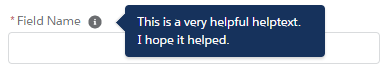
<c:customHelpText text="This is a very helpful helptext. \nI hope it helped." />
In the image above I used the help text inside my custom input component, but I will need another blog post in order to explain it. I hope I’ll have time to write it soon.
Possible improvements
The flexibility to show the help text bubble on different sides of the icon would be a helpful addition in certain cases. However, I’m no CSS guru, far from it, so it’s a task outside of my current capabilities. Also, adding an attribute to allow different icon to be shown instead of a hardcoded utility:info icon would be a quick and simple exercise.
Additional resources
If you want to learn more about the powerful Lightning Out technology and how to use it in Visualforce Pages follow this link. I believe that it’s a must use tool for any company that wishes to transition from Salesforce Classic to Lightning Experience.